The lines between engineering, product, and design are ever more blurred, and every product org operates uniquely. The most valuable part of working at InVision was talking with all of these various design teams, learning what was and wasn’t working for them, and challenging ourselves to build systems and tools to push the software industry forward.
InVision
Senior Product Designer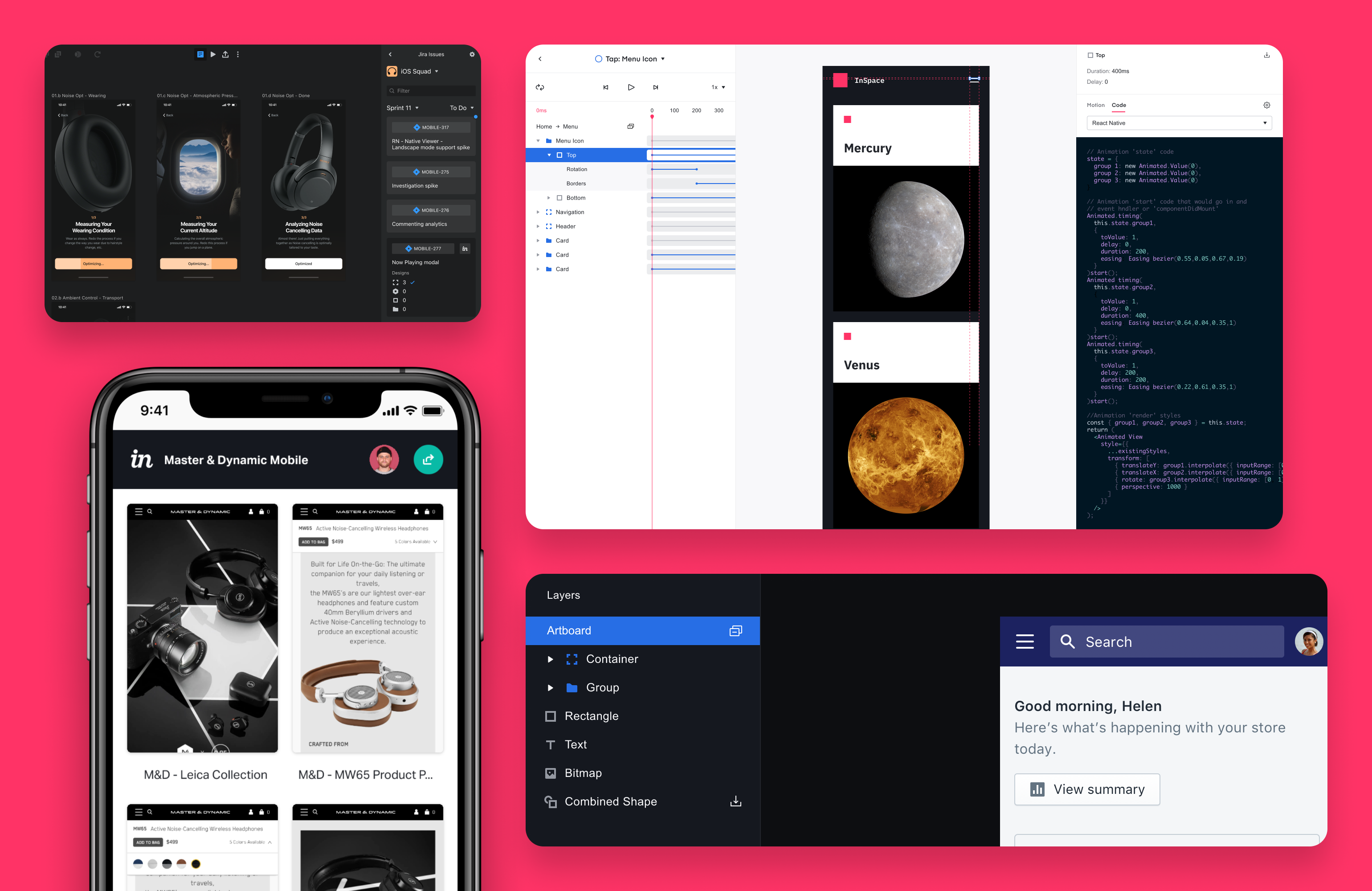
Mobile Prototype Viewer
The first project I worked on was redesigning the prototype overview and previewer. The previous experience was nearly six years old, wasn’t mobile-friendly, and lacked proper navigation. Additionally, Studio introduced a more comprehensive range of appearance settings, like device skins, various dimensions, and auto-scaling, making the viewing experience unpredictable across devices.
We tested every possible scenario of how various prototypes — watch, phone, tablet, desktop — were presented in a mobile browser. We also created a survey to gather the preferences of 2,000+ customers.
The results of this research led us to design a matrix of sensible defaults and a simple interaction allowing the viewer to toggle between the creator-defined setting and an auto-scale override.
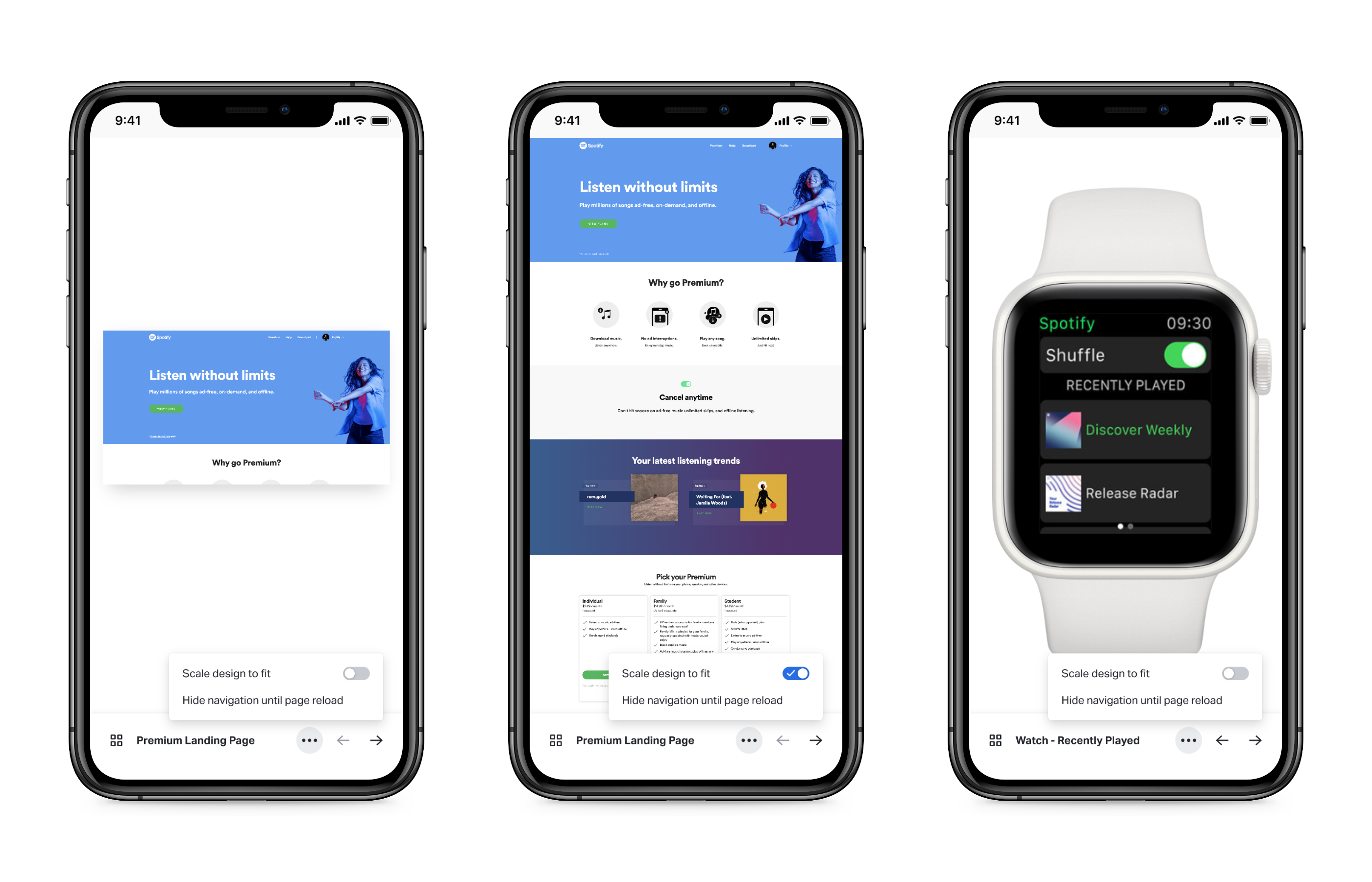
We also used this as an opportunity to design a new mobile navigation that allowed the viewer to move between screens in a prototype and navigate back to the screens overview at any time. It seems obvious, but neither of these options previously existed on mobile. The navigation is a handy way for stakeholders not yet familiar with the clickable prototype.
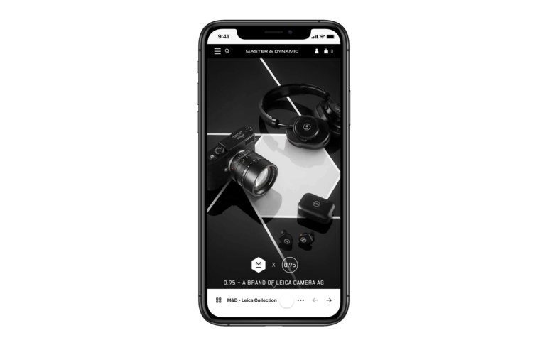
Inspect for Studio
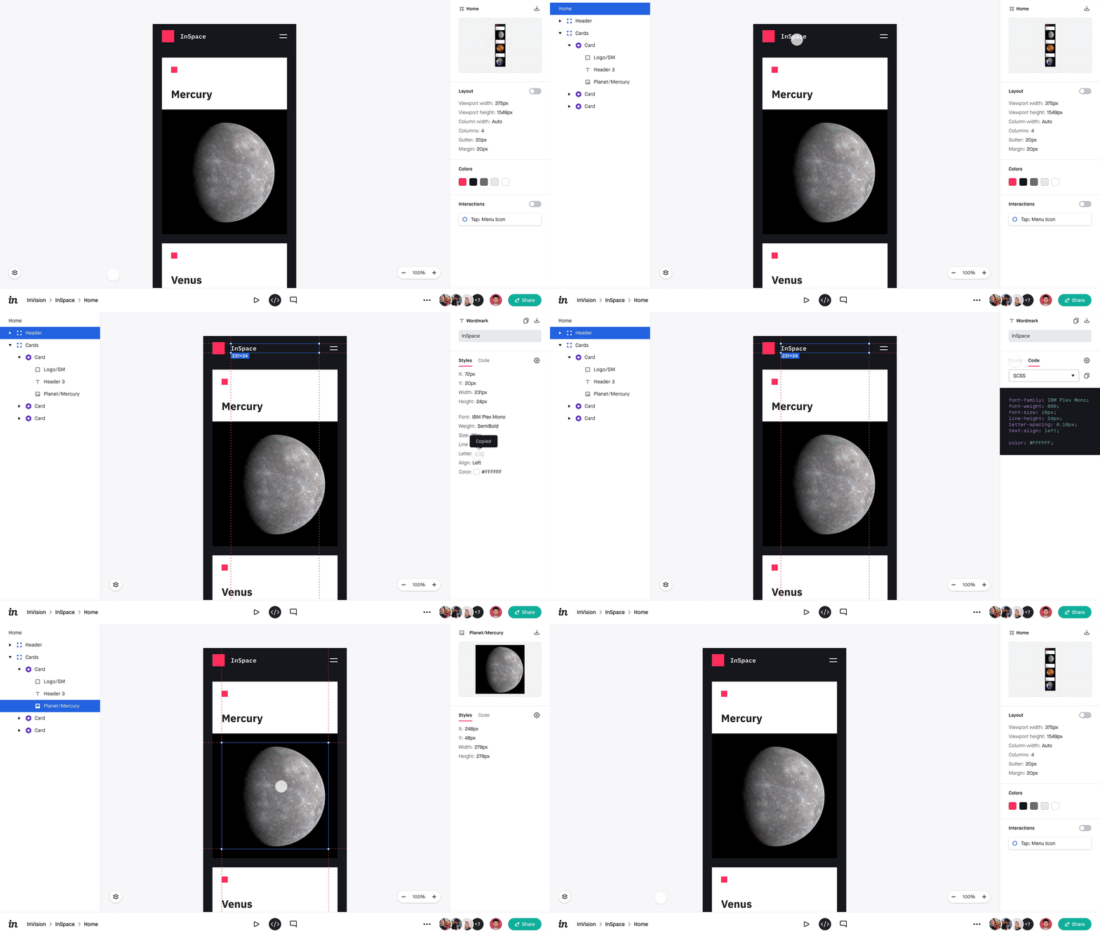
Next, we surfaced more of the Studio design file on the web by rethinking the InVision Inspect product from the ground up. We already had this feature for Sketch & Craft users, but it struggled to meet the growing demands of developers and the changing landscape of how they collaborated with designers. This was an exercise in listening to both what data they needed and what features were getting in the way. We rearchitected the information design to bring what they needed front and center and to account for any future properties that might be added to the design tools. We monitored our instrumented metrics, gained in-app feedback, and made continuous improvements for each release of the product, always with the goal of having developers spend less time in our app and more time building theirs.
Inspect Motion
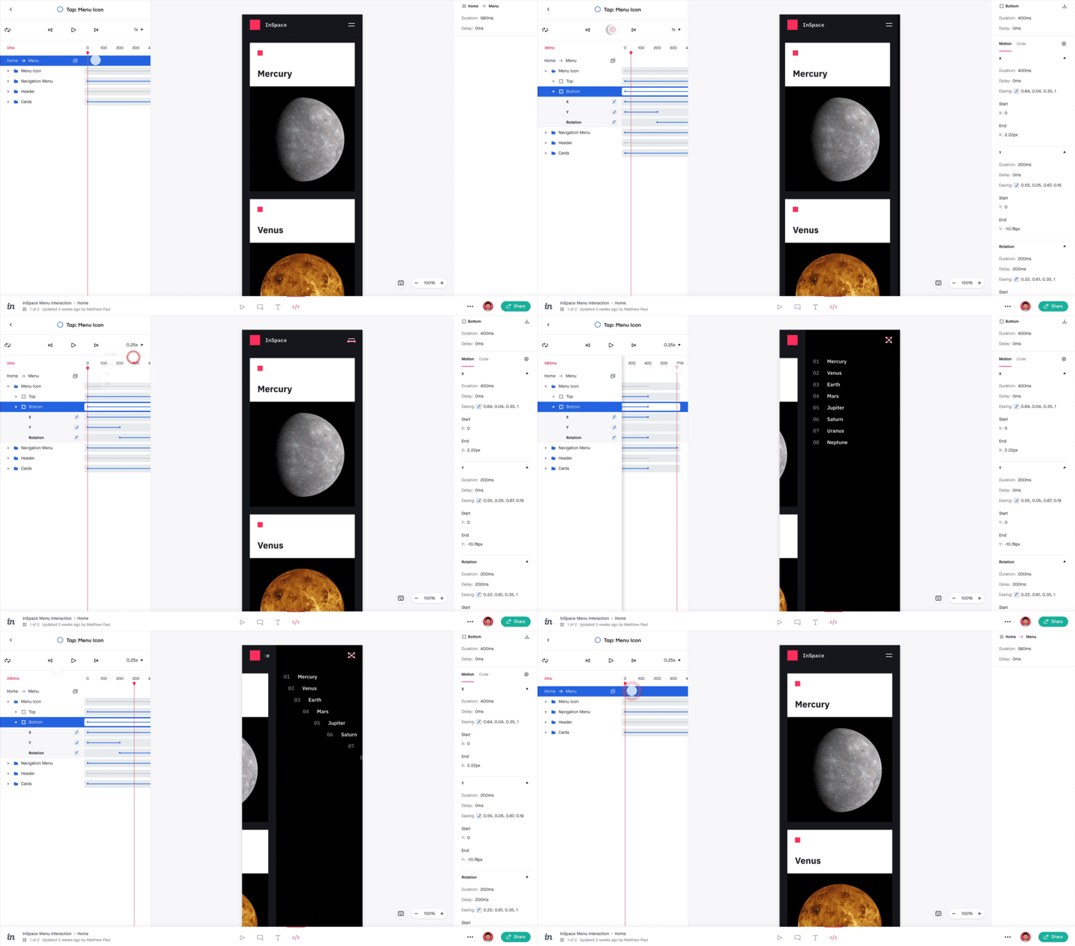
With the advent of InVision Studio, designers and other creatives were given the ability to create complex UI animations with granular control over every property. They can even customize any property’s duration, delay, and easing. The result was some of the most beautiful and thoughtful animated prototypes our industry had seen—one’s that you could actually click or tap through on any device (not just watch a movie of something created in After Effects).
Working with the Inspect team, we were challenged with creating a tool that allowed developers to collaborate with designers on these animated prototypes; they needed to inspect every motion detail to bring it to life in code. We identified an opportunity to build a developer tool that hadn’t ever existed before, which allowed me to contribute to all parts of the product lifecycle — product strategy, generative research, ideation, prototyping, refining of the design, user story mapping, building the tool along with the engineers, usability testing, and eventually release the large feature.
We continued to iterate on this feature after running usability tests with customers in which we had them use a beta release of the app to program some motion into a CodePen demo that we pre-coded to exactly match the Studio prototype. Through these sessions, we quickly learned that developers wanted code snippets and not just the data-list view as a starting place. Inspect Motion provides starter motion code for most properties in CSS, Objective-C, Swift, Android, or React Native.
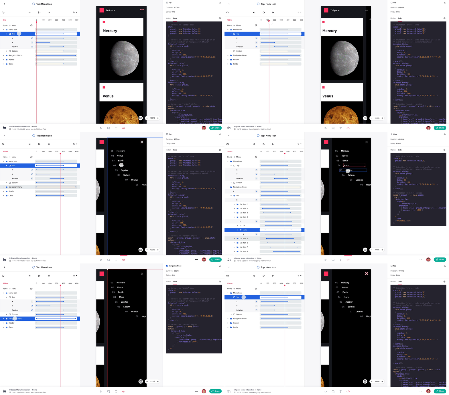
From the beginning, we knew that we needed to build this tool with keyboard-only users in mind. Inspect Motion is optimized for efficiency with keyboard shortcuts for navigation, canvas selection, traversing the timeline, and motion playback.

Design System
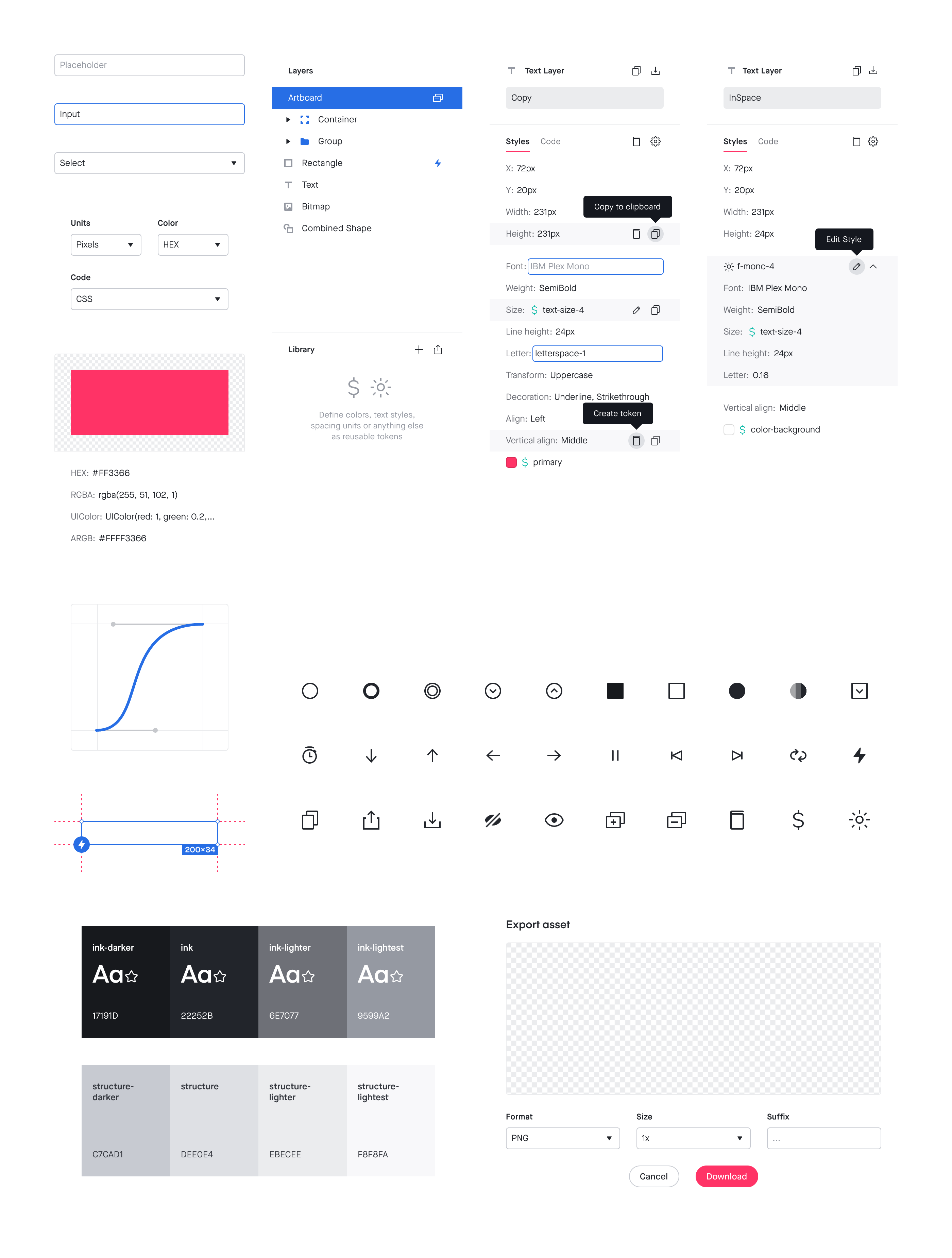
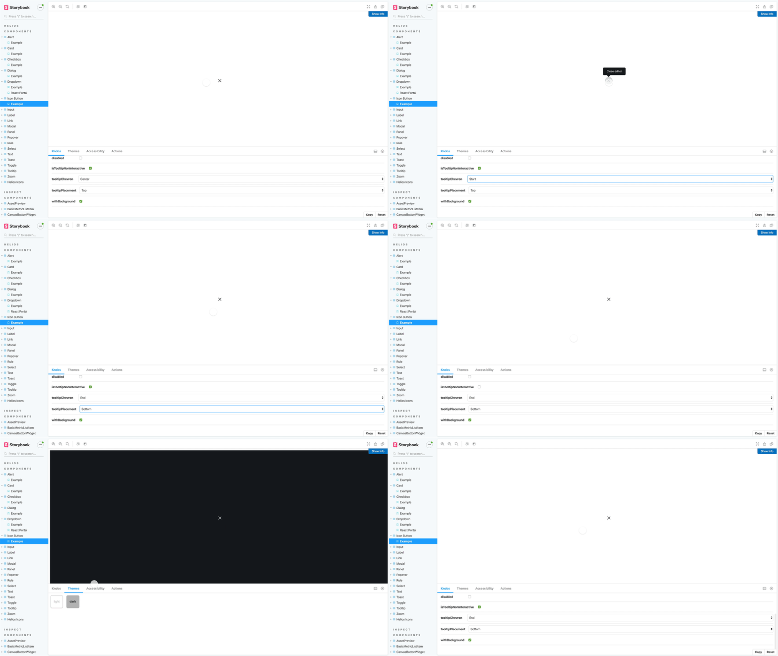
After a few feature and product launches, I was asked to take on extra responsibility and be the design system partner for all of InVision’s web properties to help make sure each team’s needs were met. We began having “Helios Office Hours” every other week, and I eventually led an extensive audit and refactor of the system’s typography, spacing units, and standard component sizes. I also contributed many new icons to the system and helped build a Studio library and corresponding React Storybook of UI elements for my specific product area.
Jira Integration
In early 2019, InVision and Atlassian came together to develop new tools and integrations that bring designers and developers closer than ever before. I was selected among two other designers and a product manager from InVision to work with the Jira and Trello teams at their San Fransisco Headquarters. Being experienced in facilitation, I helped the product manager plan the schedule for the 5-day sprint.
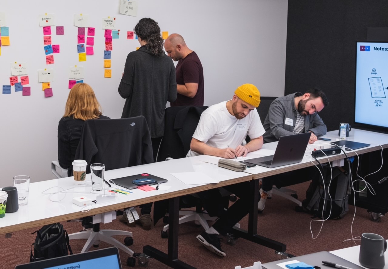
While our ideas were varied and the problem space huge, we had to come out of the week with a few tangible designs that each company could implement relatively quickly.
With the Jira app for InVision Studio, designers can now view and act on Jira issues from within their design tool. This allows them to stay in the flow and avoid hopping back and forth between different environments.
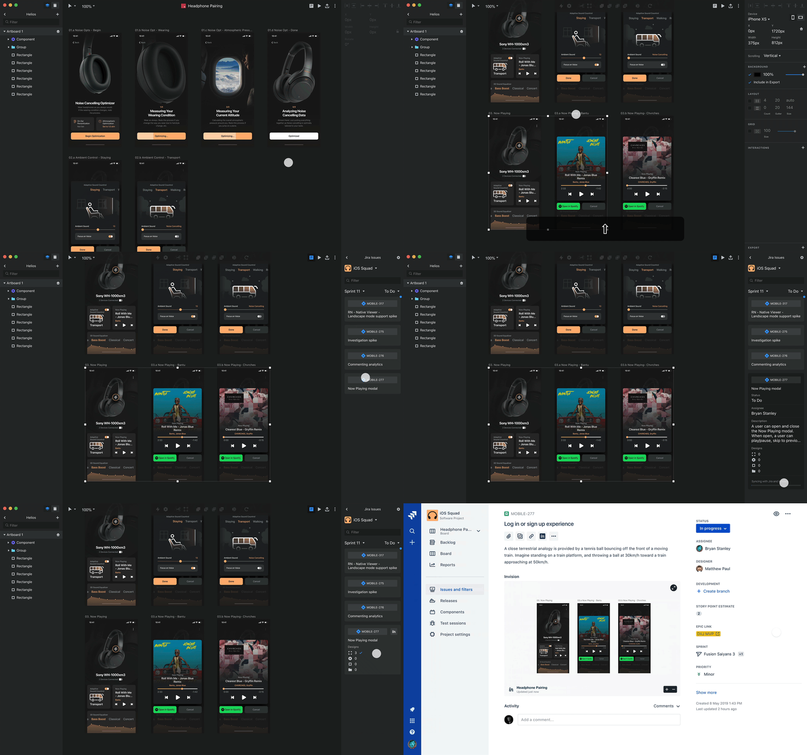
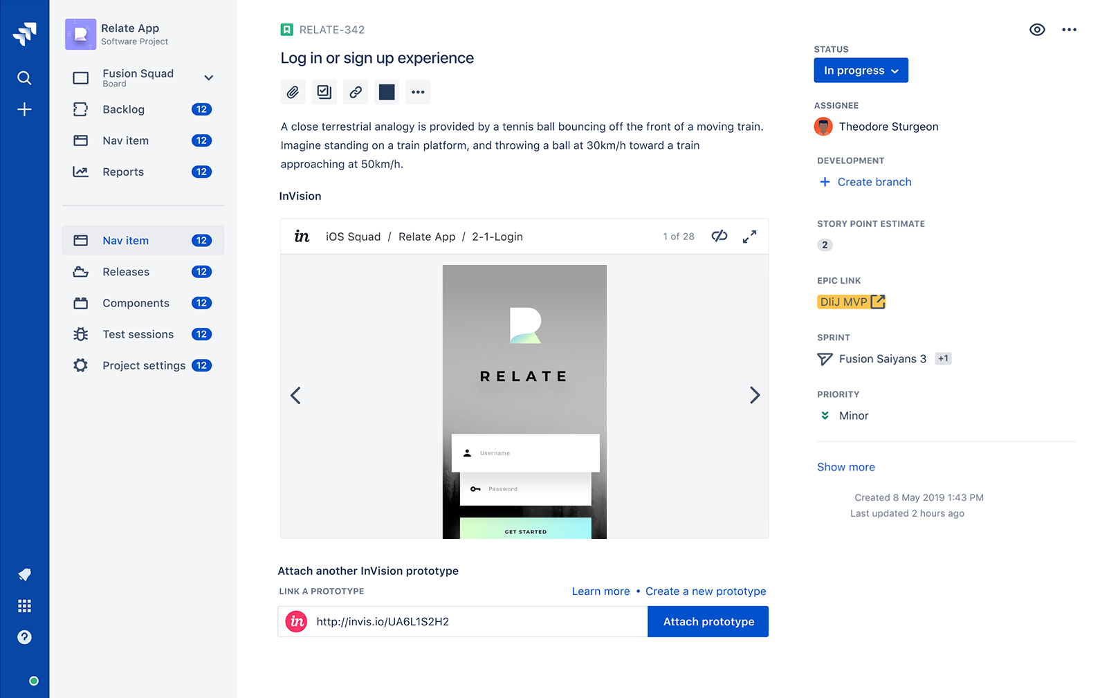
But what if most of your workflow is in Jira, not a design tool? After all, many other members of product teams spend much of their time in Jira documenting work, discussing details, and managing issues. Having to jump into a design tool to see the details of a particular interaction introduces unnecessary friction. To solve this, we worked with Atlassian to build enhanced prototypes within Jira — developers can now interact with, comment, and inspect the prototype without ever leaving the tool they were already in.
