The.com Page Generation
I led product, design, and design systems for this 14 person seed-stage startup. The.com is a no/low-code sheet-based website builder and CMS tool. I helped them learn from their early customers through generative and evaluative research, iterate and improve on their core product, and design a completely new feature & product surface area called Page Generation.
I also designed and helped engineer a design system from scratch—typography and type scales, 0–10 color ramps, spacing units, iconography, and complex components—in both Figma and React. The Page Generation project enabled the team to sign big-name customers such as Adobe and Ramp, and succesfully find product-market fit.
Product Highlights
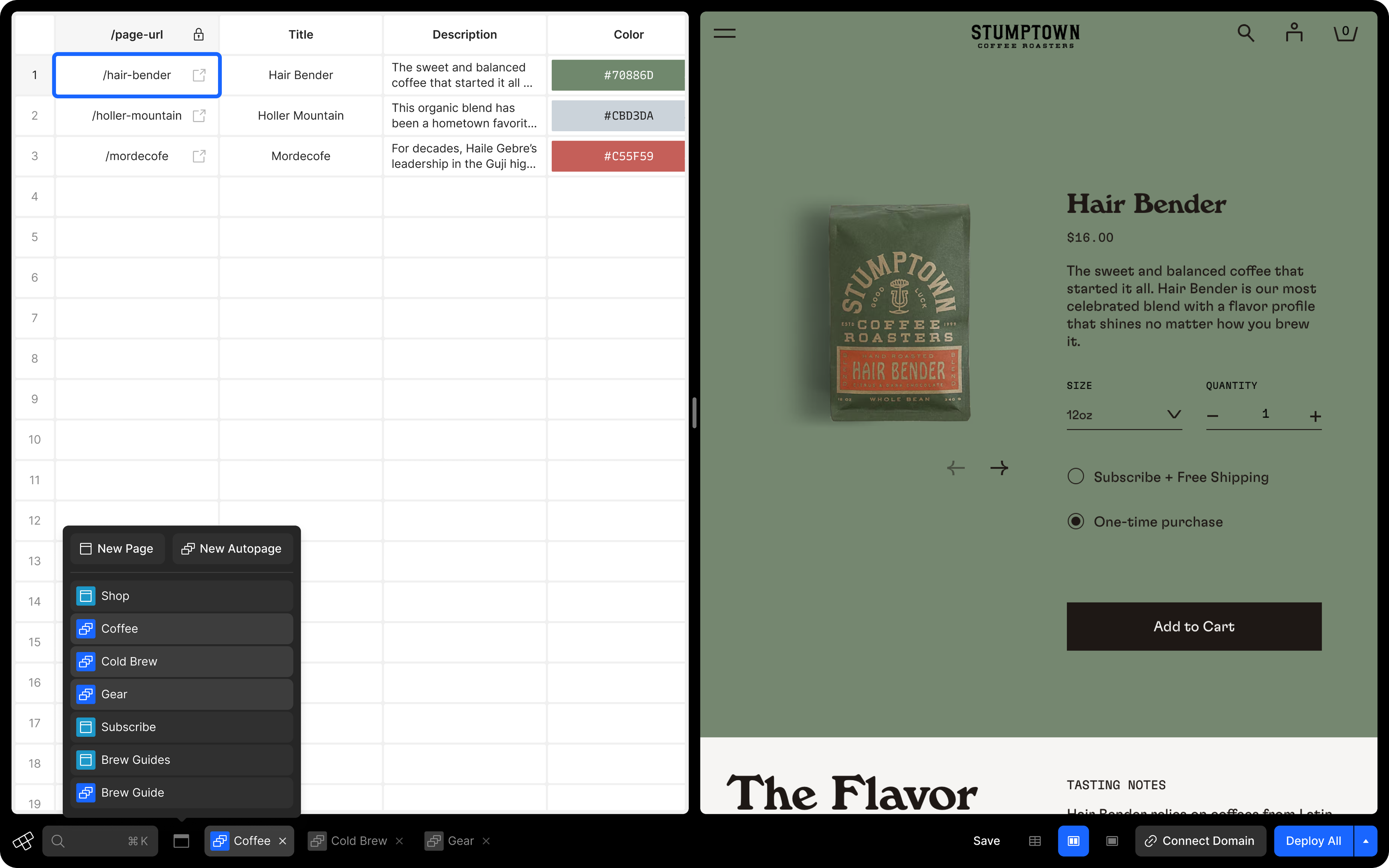
Manage all of your single and generated pages in one place
Use the pages menu to add, select, edit, or close any page of your website. This one-stop shop allows you to create new one-off or auto-generated pages and easily navigate through your workflow.
Customize your view for how you like to work
Work side-by-side, collapse the sheet to see a full view of the selected page, or collapse the page to focus on the sheet. And use the view switcher to change between the left, right, or top-and-bottom orientations.
Drag the handle to even further personalize your view
Whether you’re in the side-by-side or top-and-bottom view configuration, use the drag handle to optimize the view for exactly how you want it to work and preview the responsive page you’re working on.
Why did we build this?
The Problem
- In the previous iteration of the product, users didn’t have a way to see both the pages they were designing and the content they were creating, editing, and linking to a page in a single view. This led to a constant back-and-forth, forcing them to completely switch contexts when making edits to the design and the content.
- When a user wanted to work on the content in the sheet, they had to navigate back to another view called the “worksheet” and then search for and open the corresponding sheet. It was a clunky user experience that needed a complete overhaul.
- There wasn’t a way to create page templates and use the power of the spreadsheet CMS to generate multiple pages quickly. Users could only create one-off pages with corresponding sheets.

Research and opportunities
I created a series of surveys to identify pain points and set up interviews with our early users of the product to see firsthand how they navigated through and worked with the as-is experience. This rapid research was invaluable in helping to give more shape to the problem and identify constraints and opportunity areas.
- Seeing both the CMS sheet or the editor sheet, along with the page the user is working on, is a must-have
- Even with the CMS sheets as panels instead of their own full-page view, the sheets should still have their full capabilities, which required rearchitecting how they were built
- The editor experience should feel more configurable and cater to how different users want to work; people prefer different setups and layouts when doing this type of web design and content management work
- Horizontal space in the bottom toolbar was becoming a problem and needed to be addressed

“Useful features that come to mind would be a way to create style themes & page templates, a robust CMS to create dynamic areas throughout the website, and more customization with less effort.” ― Riley Jones
An opportunity to redesign the entire editor
Creating a vision
As a founding product designer or a staff-level designer, you need to do more than be able to own multiple workstreams and execute product briefs that are handed to you. You must proactively uncover problems or opportunities and create proposals of an idea by pulling together data, writing documents, identifying user anecdotes, and pairing these catalysts with very explicit mockups or prototypes to show how you might create a new opportunity or product vertical.
My role at The.com, and specifically with this project, required me to take the seed of an idea, grow that idea, figure out how to navigate the small organization and lead the product vision autonomously, and create different types of artifacts for different people internally—each of the co-founders, the head of engineering, and the team of engineers—to get buy-in, gain momentum, and give that idea a chance to be realized and actually make user and business impact.
Our hypothesis
If we could redesign the product IA to consolidate surface areas and navigation and redesign the editor to create an experience where users can design page templates that allow them to create and auto-generate content side-by-side with the pages they’re designing with more configuration & customization of their workspace, we will speed up their workflow and enable them to build more SEO-performant websites by rapidly creating more pages using this new model rather than relying solely on creating one-off pages for every instance of a page with repeating similar layouts.
Our research and data showed that websites should have a minimum of 35 pages to perform well for SEO. We also learned that websites with 50+ pages had significantly better chances of showing up higher in search results and an increased chance of being the featured search result with rich data (images, videos, and snippets of content displayed in larger text).
Exploration and prototyping
I explored many different directions and possible solutions to address the pain points and opportunity areas to put in front of our internal team, the co-founders, and a select group of early users. This helped build momentum for the project and narrow in on the final solution.
Switching pages and orientation
While working towards this side-by-side view, I explored options by including explicit icon buttons (essentially radio buttons) for each row of the sheet to allow the user to choose which page they wanted to view. This early exploration also included all four view configuration options—side-by-side, top-and-bottom, sheet-only, and page-only; and the ability to use the drag handle to change the size of the sheet and page ratio.
We quickly learned that some of these ideas weren’t the best:
- Due to the nature of focus-state management combined with how users told us how they preferred to work with this new design, the icon button to explicitly choose which page to view was clunky and added an inherent extra step—users would rather have the visible page be directly tied to which cell in the sheet was selected.
- Not only did showing all four configuration options increase the amount of horizontal real estate in the toolbar (which was the opposite of one of our goals), we also learned that users never wanted the sheet-only or page-only. Instead, They would rely on the drag handle to grow or shrink the sheet.
Gallery view of multiple pages
In another exploration, inspired by the old Apple gallery view in Finder, I wondered if showing “hints” of the other pages that corresponded to each row in the sheet would be an interesting way to give the user more ways to navigate when working with large datasets and number of pages.
Ultimately, this idea didn’t resonate with users at all, so we quickly tossed it out.

Page previews on hover of the URL column
An ancillary idea that I explored, which could be used in combination with whichever final solution we landed on, was showing thumbnails of a page when hovering over the URL cell for that respective row in the sheet.
This also shows our pivot to the direction users were telling us they wanted—the selection of any cell in each row would display the corresponding page.
Deploy status for multi-page deploys
Before this project, we didn’t provide users with much feedback about their deployment status when they chose to deploy a new version of their website or an individual page. Given this newly redesigned model, which allowed users to generate tens to hundreds of pages based on a single design template that they built, I knew that we needed to give users more information and real-time feedback about the status of their deployments.
Different configurations of the view switcher
Finally, based on the combined feedback from our users on earlier explorations and our goal of addressing the horizontal real estate of the toolbar, I explored and narrowed in on an ideal solution for the “view switcher” controls.
Based on their feedback, we wanted to offer some levels of customization for the user. Because this isn’t a primary action that any user is going to change often, we ended up deciding to build the configuration options as a menu triggered by a single icon button.

How it all came together
After many rapid explorations and sharing ideas with early users in our community Slack channel, we landed on a solution that included a complete overhaul of the editor that met all of our goals. It was well-received by our users and opened up even more possibilities for future innovation, including an AI-generated content experience to create pages even more rapidly for each of their auto-page templates.