Bubble Pop Design System
Lead Product Designer
When I joined Bubble, they had only just started a component library effort, and I led the design of a powerful new design system in Figma and in code. With “Editor Modernization” being one of the company’s top priorities, and with a design team that grew from 2 to 10 within a year, the team needed someone experienced in both craft and technical implementation.
This new and growing design system provides a comprehensive set of design tokens, icons, uniquely complex components, guidelines, contribution models, and documentation that empowers Bubble’s software engineers and product designers to build polished and consistent interfaces that align with the company’s evolving product direction.
Where design and engineering intersect
The contribution model to the Pop design system was a distributed collaboration between a few designers and a couple engineers on each team that I oversaw and directly contributed to every piece of. My favorite thing about design systems is the inherent way they foster deep collaboration between designers and engineers to bring resilience and speed to the product development process.
Typography scale
I brought my deep expertise in mathematical web typography to Bubble and the Pop design system. Earlier in my career at IBM I invented an approach and open-source tool that uses a quadratic progression formula for type scales specifically designed for screen-based media.
In mathematical progressions, there are 4 primary types: arithmetic, geometric, harmonic, and quadratic. The rest of the industry was using geometric progressions such as the golden ratio, minor thirds, or major fourths, which all had underlying problems. In geometric progressions, you simply multiply the previous value by the chosen ratio (such as minor thirds). The result of this is font sizes with 10+ decimal points. These values can be rounded, but this method came from print and was attempting to be retrofitted for screens.
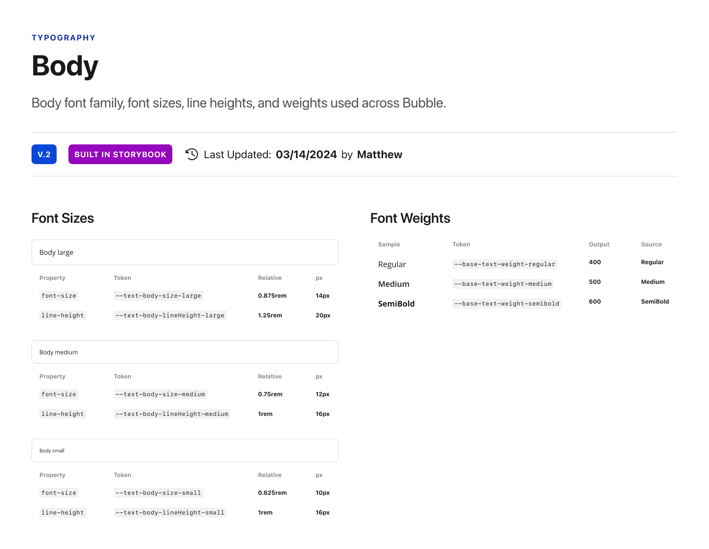
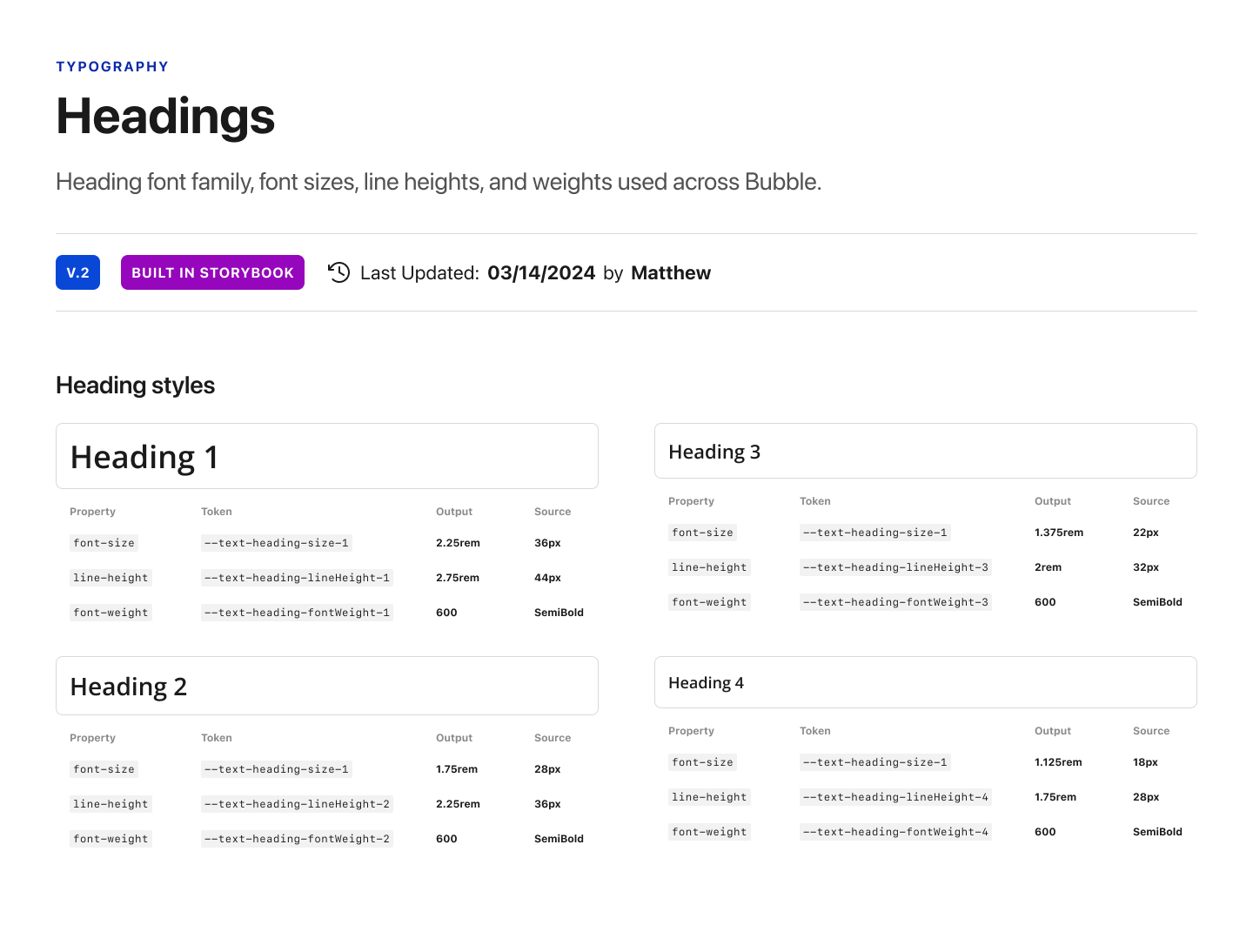
What I discovered in the benefit of using quadratic progressions is that you still get the non-linear growth you want in a type scale for proper hierarchy, and you also get sensible whole numbers as your font sizes. This is what that looks like in practice.
Body font system
Headings font system
Design token architecture
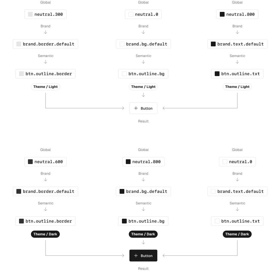
Design tokens allow a company to establish its core visual language, map the global values to brand values, and eventually map the brand values to semantic values for use in components. This also enables easy transformation at the core level as needed to switch themes, such as light and dark, or entirely new brands with much less effort and cost than building each from scratch.
Design tokens are created in close collaboration with engineering to ensure immutable alignment with code. We achieved this by using the Tokens Studio Figma plugin that syncs to GitHub, allowing engineers to have a shared language with design at every level of the system.
Systems within systems
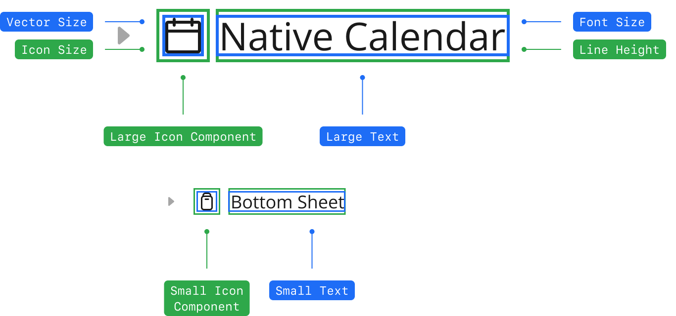
A design system is made up of many sub-systems working in unison. For example, the line height of a label when paired with padding impacts the size of a component, and component hierarchy impacts the larger modules that are composed together when building a view. It’s essential to be aware of how making one edit in one place can cause a ripple effect throughout the entire system. This is one reason why design systems are an ever-evolving product that requires taste, extremely high attention to detail, and strong systems thinking.
All of this may seem complicated under the hood, but the end result is a high-craft, polished, intuitive interface for the end-user experience. One method to uncomplicate the complicated is through t-shirt sizing at the atomic component level—Small, Medium, Large. When done well, all components of the same size work together and can sometimes be intermingled to create a desired hierarchy.
Component architecture
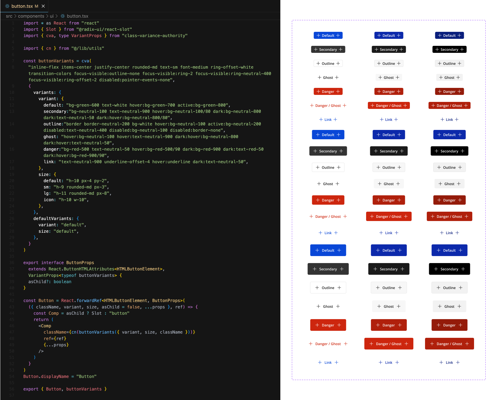
For this system, we approached everything as a component, starting at the atomic level. This allowed for handling component sizes and variants at this level instead of trying to build every size and variant for more complex components composed of many other atomic components. This resulted in both consistency and flexibility when needing to design in Figma and build in code.
Documentation
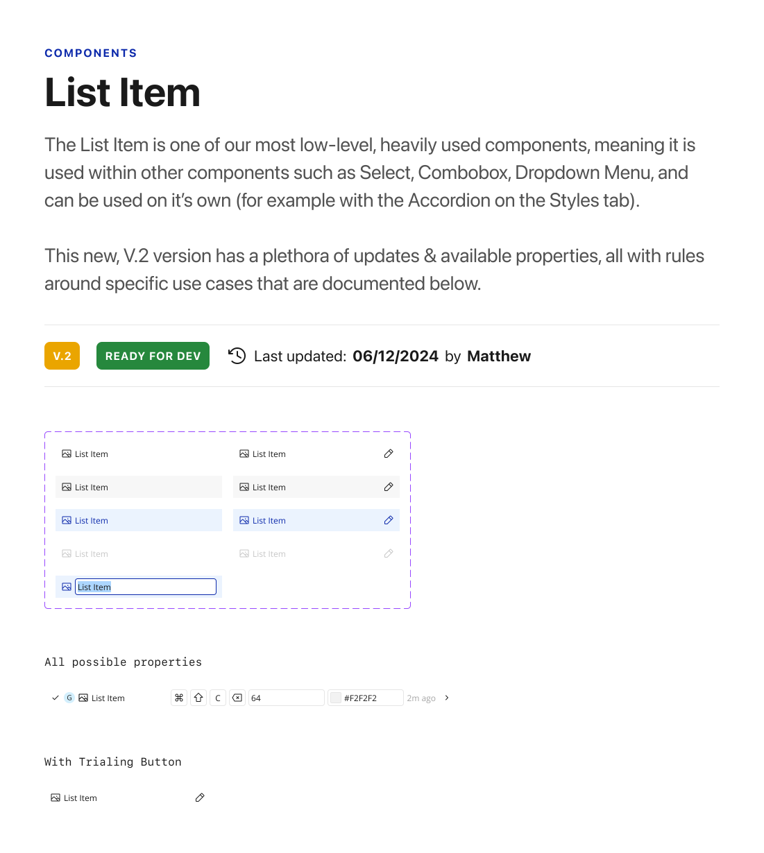
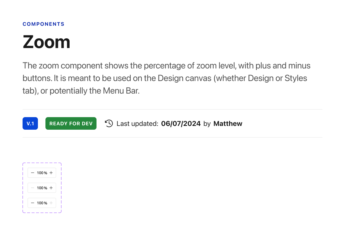
Any product or design system is only as good as its documentation. For design systems, this means written documentation in Figma to give consumers a place to find out everything they need to know about a design system component, properties, or tokens. It also means healthy documentation in code, which can, at its best, be written directly in each file and automatically surfaced on a design systems documentation website.
Among documentation at Bubble, I continued the system education through mentoring other designers, bi-weekly office hours, bringing topics to design critique, and sitting in on design reviews with other teams.
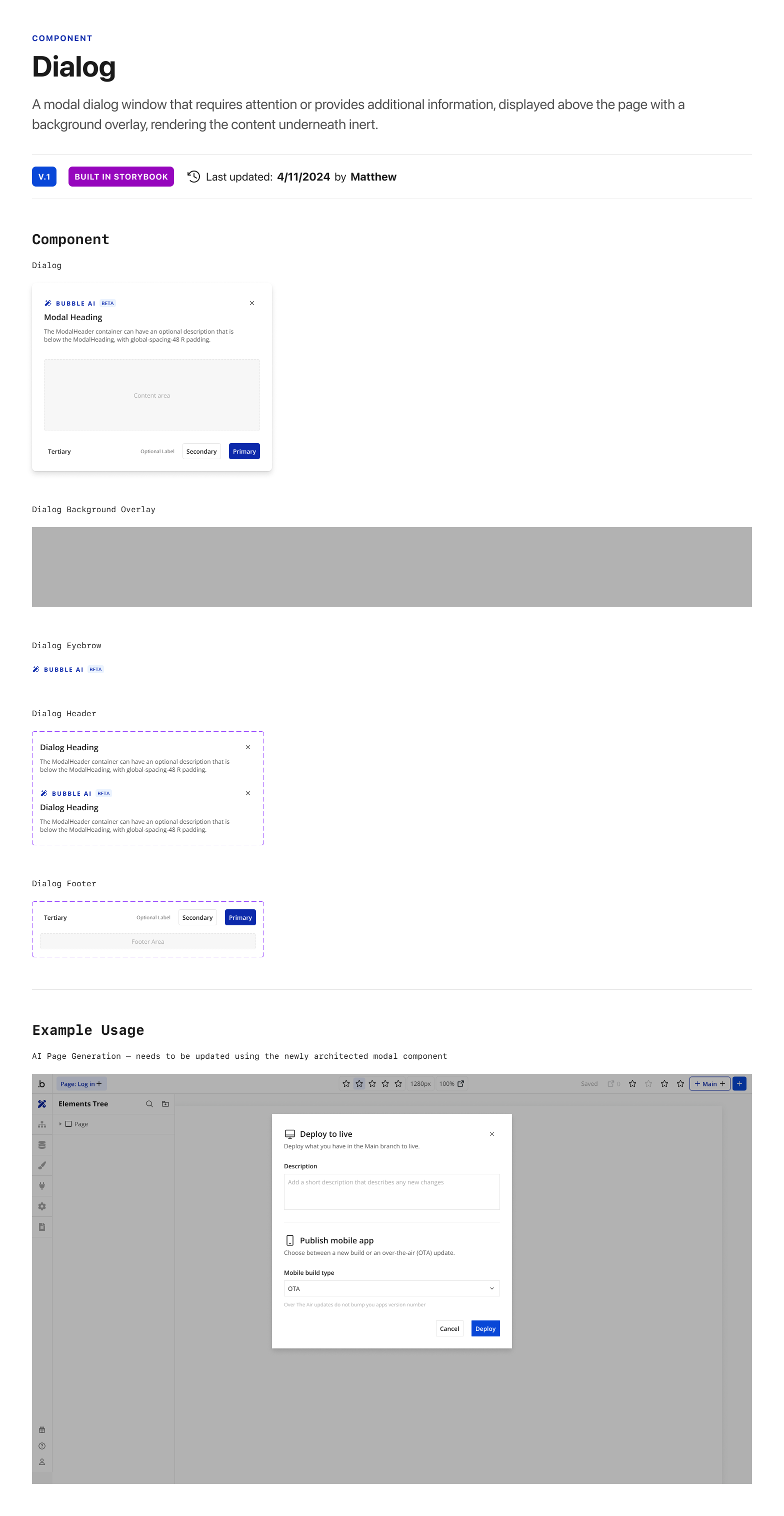
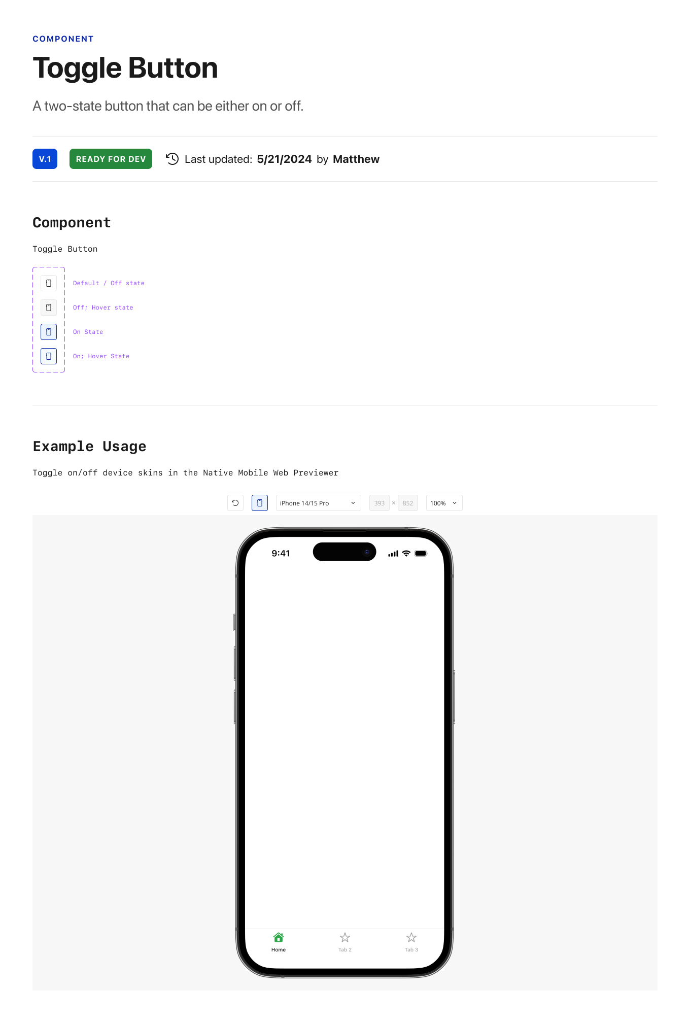
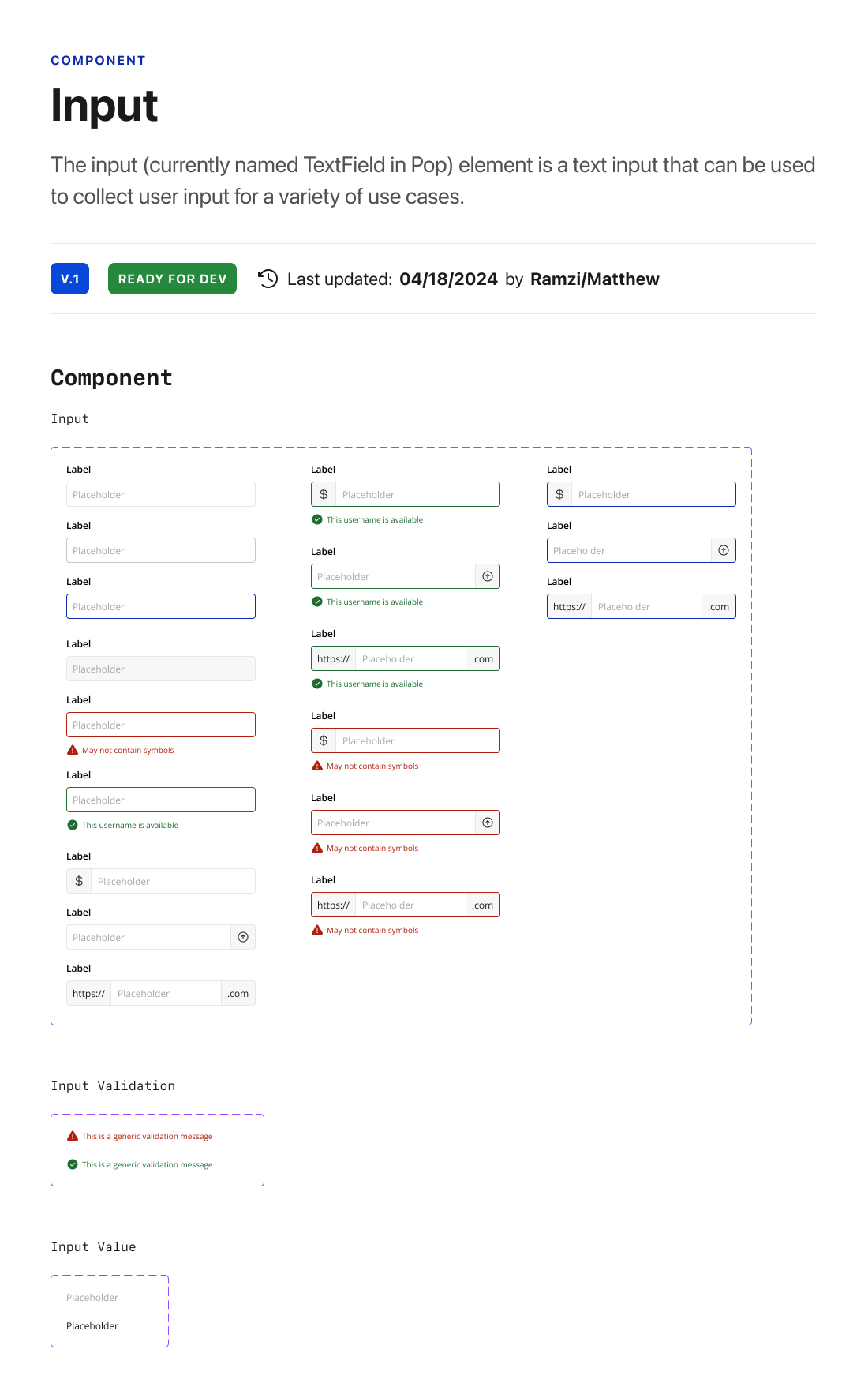
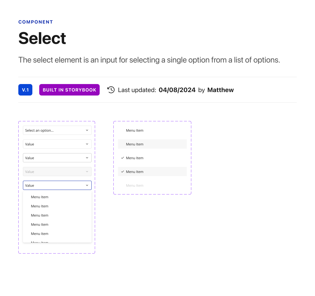
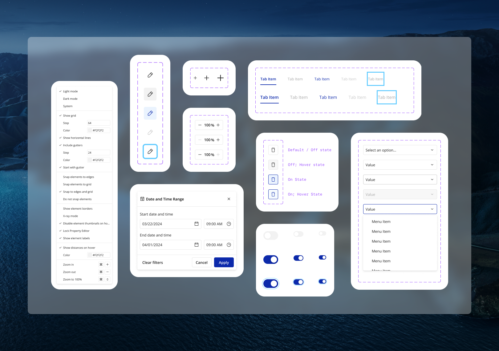
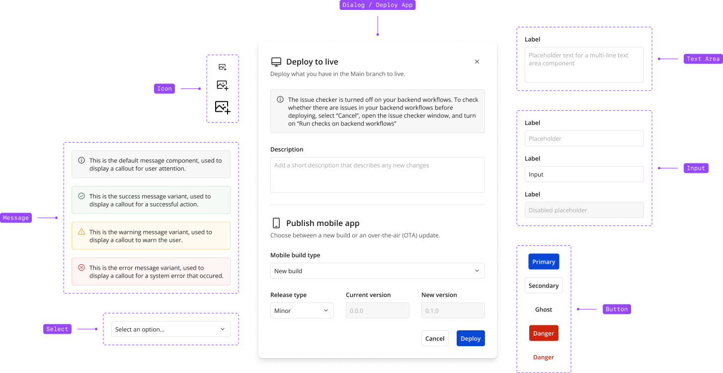
A selection of components that I designed
On top of designing the foundations of a new type scale, color ramps, icon library, and design tokens for text, color, elevation, and border radius, I refreshed the few existing components and designed 20+ new components. I also helped the engineers architect the React components and was a required reviewer for each non-trivial design system PR.
